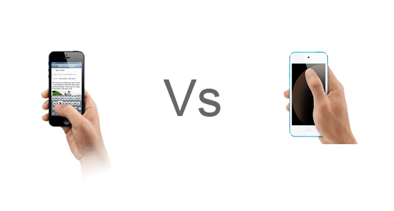
Was the iPhone 5 event a let down?
Posted: September 13, 2012 Filed under: Random Talk, User Experience | Tags: Apple, iPhone, iTunes, Smartphone Leave a comment »As always, the world turned to California to check on what’s apple next offering on phones side, and also to check if there are any other upgrades to their current lineup of products and possibly the introductions of new ones.
The event in review: new iPhone, new iPods, no iPad Mini = few if any surprises. Did Apple disappoint? I don’t think so, but the iPhone 5 was heavily spoiled by the excessive leakage of the new phone parts, and that’s where most of the hype is focused on the Fall event, as always. Granted, much of the iPod news were cloudy, but except for the iPod Nano, which is the product that always changes the most, everything else was just predictable. The new iPod Touch is as expected, an iPhone 5 without the phone and few minor downgrades and featuring smaller and lighter design. Without a new product to show (bet the ones predicting the iPad Mini will move it to 2013), Apple’s event felt almost like if it wasn’t needed to begin with. Still most of them are great products, and that’s why is not a real let down, was just extremely predictable.
But let me make it clear, I don’t want to saturate the internet with even more repetition of the same information; you can check other sources for all the detailed information or even Apple’s site. What I want to do it’s a breakdown of the event and talk a bit about its products on the design and engineering perspective.
With that in mind, let’s begin!
iPhone 5
The new iPhone is bigger and small at the same time, a bit lighter and slimmer, but longer which accommodates to a new a bigger screen that is close to a standard widescreen ratio which must be amazing for consuming content. Some people criticized that Apple didn’t do a bigger screen all around and their answer had to do with ergonomics. Supposedly the width of the iPhone 5 is not bigger because it fits better in your hand, and I can surely bet that it has to do with the thumb, the finger that let us text messages and interact with different apps singlehandedly needs to reach to every part of the screen to support full interactivity with one hand. Assuming that Apple did their research they had the perfect size before, but why now add the extra height there? So the old screen had the wrong size all together or the new screen is wrong?
Here’s a video to illustrate my point:
If they designed the phone thinking about the standard human hand, I should be able to comfortably reach the top of my current iPhone screen, but if is higher I would rather slip my hand, and that’s what they do on the pics that shows how the thumb actually covers the whole screen, but again you will have to move your hand and that’s an extra step.
In the end I think is not that much about the thumb since software can be designed with that in mind, but about the hand, so in terms of making it bigger, longer was the way to go.
I actually like the new connector, the old one had almost a decade and was unnecessarily big, plus offering an adaptor at least brings an option to the consumer, but ads a lot of confusion to the product compatibility with accessories and other first and third party equipment. A new connector after a whole decade it’s ok, and I trust Apple will do the migration as painless as it can be without getting into the horrible port confusion that plagues some electronics, e.g. the display ports on the PC. In any case, by watching the advances in wireless technology we might not even need a connector in the future other than to charge it (until wireless electricity is viable).
There seem to be few changes in the back camera but a much needed upgrade on the front one, highly positive now that Facetime is going wild, and judging on how much people love to video blog or take portrait pictures, this will be just awesome.
iPods
First and foremost, what’s the deal with the strap on the new Touch? I don’t like the idea at all, iPods are products that you want to sit next to you on the bed or a sofa, sit in your pocket happily, is just changing of postions constantly and is not glued to your hand. Yes, the strap can make it more secure, but it severely limits the experience if your wear it all the time, plus, is going to tangle up with your earphones for sure. Weird idea that probably came from demographic research, but I’m not quite convinced. Other than that, the touch had is well needed refresh.
The Nano basically ignored pretty much that the 6th generation existed and went back to an evolution of the 5th, not a bad thing to do since the previous nano was more like a glorified shuffle. What I don’t quite get is why they made the design not consistent with iOS, the icons are now rounded and the home button too. Why they want to differentiate it? I assume they want to tell the user that, although this works in a similar way to iOS, is not a fully feature operative system, making it much like a focused toy, not a bad thing if the people that are being targeted wants something simple.
And the Shuffle? let’s not even start. No refresh at all, not even higher space or cheaper price, just new colors. Apple, you better had a new redesigned shuffle next year to make up for this. Definitely the biggest disappointment of the event. The reason for that is that I consider the shuffle the epitome of the simplicity and that is just about music, I love it! To think it doesn’t deserve a redesign is like saying they have a perfect product, which is never true. It can also be that they will slowly move it from the spotlight, like they did with the iPod Classic which also deserves a refresh. The iPod Classic is the only portable player with a humongous size for the person that wants to take everything with them, Apple can even evolve it to be a hub for your other iDevices so they can stream data from it.
iTunes
Finally, the refresh of the new iTunes is more than welcome. While there’s cero progress on the individual songs view, pretty much everything else is now better, and I personally love the “up next” feature, something that I was wishing for a very long time. Hopefully they translate that too to the Music Player on iOS.
Conclusion
Of course, until I haven’t tried these products I can confirm some of what I have written here. Still I wanted to state some of my hypothesis. Eventually I’ll have in my hand some of these devices and I’ll be able to tell if my early judging was correct. Is very exciting to think how some of the thinking behind these products is made since it has to appeal to so many people at the same time, and that’s why still with some of the minor problems stated here I think the event was good enough and delivered pretty cool new products to the market.
iTunes needs better previews
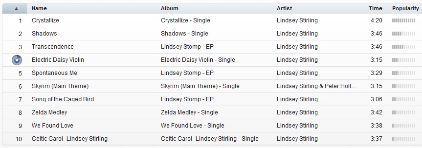
Posted: July 30, 2012 Filed under: User Experience | Tags: Apple, Fix, iTunes, Music Leave a comment »A person stands in its computer browsing for new songs to listen, she happens to open iTunes and checks her favorite artist. Their last album had one of the best singles ever and she’s curious on what’s in store on the rest of the album, and is good to know that she will be using 30 seconds previews of the songs to make her next purchase decisions. The problem is that any of the song feel right, they’re not “that good”. What about the song that she heard at the radio or at a friend’s house? its supposed to be on this, their newest album but still, can’t find it anywhere.
This might have occurred to you, but although previews are an awesome feature they require author control. Like promotional video, the cover of the album or even the shows, the artist executes a certain control on the whole process to archive what is desired in terms of entertainment or even art. None the less, previews on iTunes are either created automatically or by some people behind the scenes, not the actual artist, so who decides what’s there? Who decides what’s the most important or identifiable part of a song?
Like movie trailers can make you decide if you are going to watch a movie, this previews do the same. It’s extremely important that this continues evolving, favoring the artist and indirectly, the consumer.
Simple solution for this Apple: let the artist select if they want iTunes to generate the preview for them or let them customize it to their liking. How? Let them input the portions of the song they want to use as preview. Of course there are many ways to do this, by manually putting time or by having and simple editor that lets the author select the portion in an interactive way and preview it before sending it, and even letting the artist upload pre-authored previews. Not only this solves the problem, but artist can plan in advance for this kind of previews while they are in the studio and record it in a proper way. An example of this would be that the artist creates a very simplified rehearsal of the song, or an edited portion that actually highlights the signature moments of it.
One minor complaint on the awesome experience that digital distribution provides us, and by keeping the artist happy they will provide better content and the final users will benefit from it, and of course, your company. We need to keep evolving!

